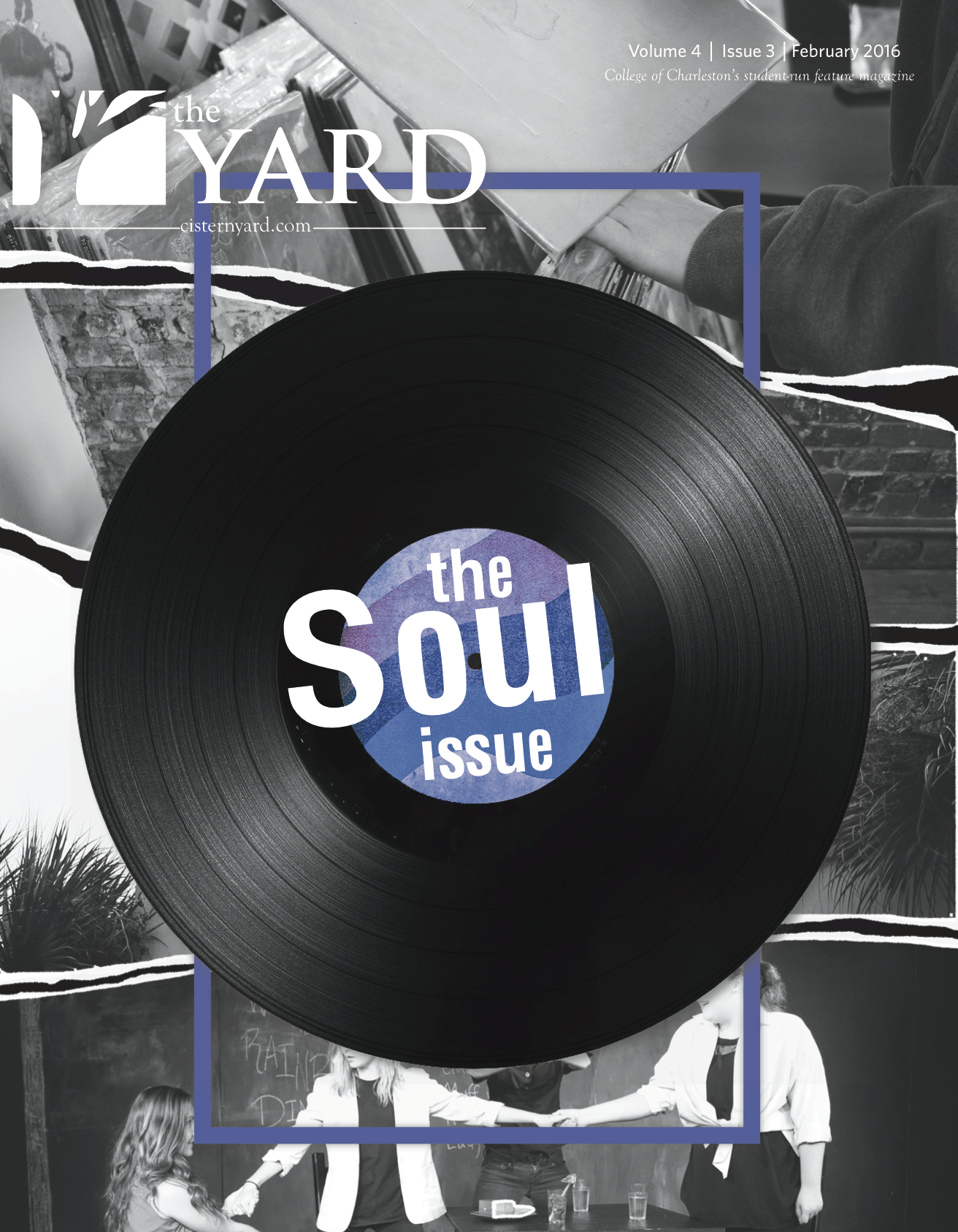
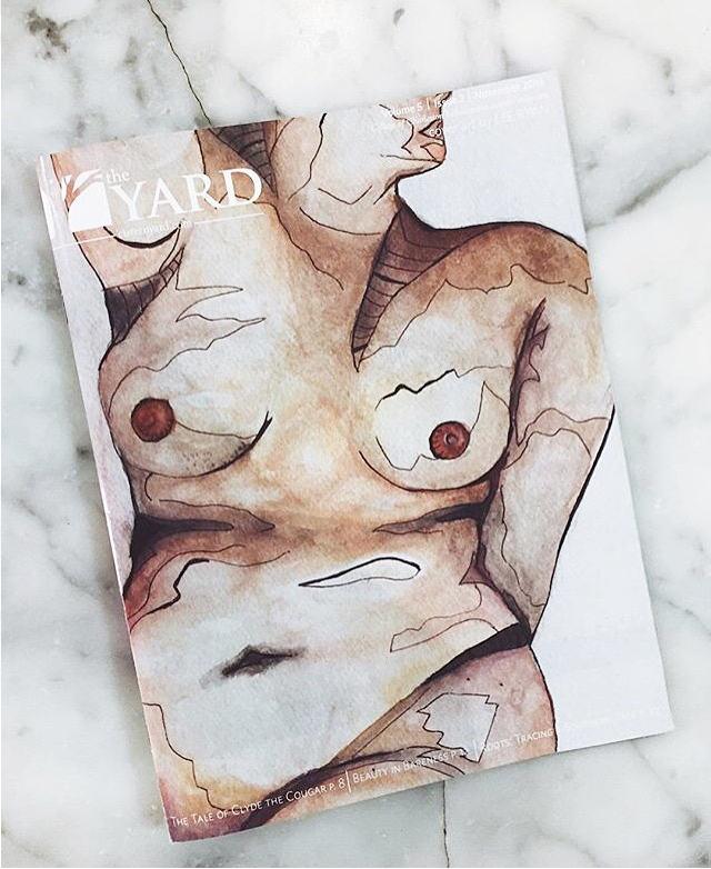
"THE SOUL ISSUE" February 2016
The "Soul Issue" was the first cover that I had the pleasure of working on. Below is a photo of my design process, starting with a sticky note.
(Click image to enlarge)
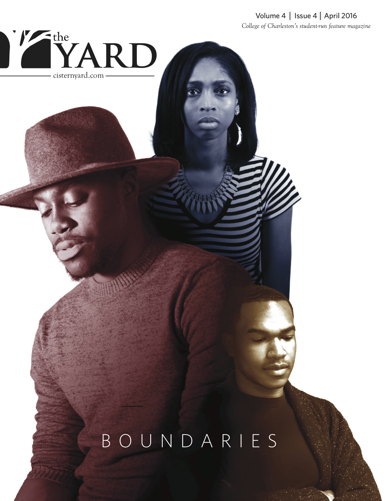
"BOUNDARIES" APRIL 2016
As the Creative Director of the College of Charleston's official student publication, I in charge of the design and layout of every issue as well as the creation of the covers. For this cover, relating to a spotlight article about campus diversity, my team and I set of a photoshoot for those who were interviewed for the article (which included myself). Afterwards, I edited the photos to make a semi double exposure of the three models. (InDesign, Photoshop, Adobe Illustrator)
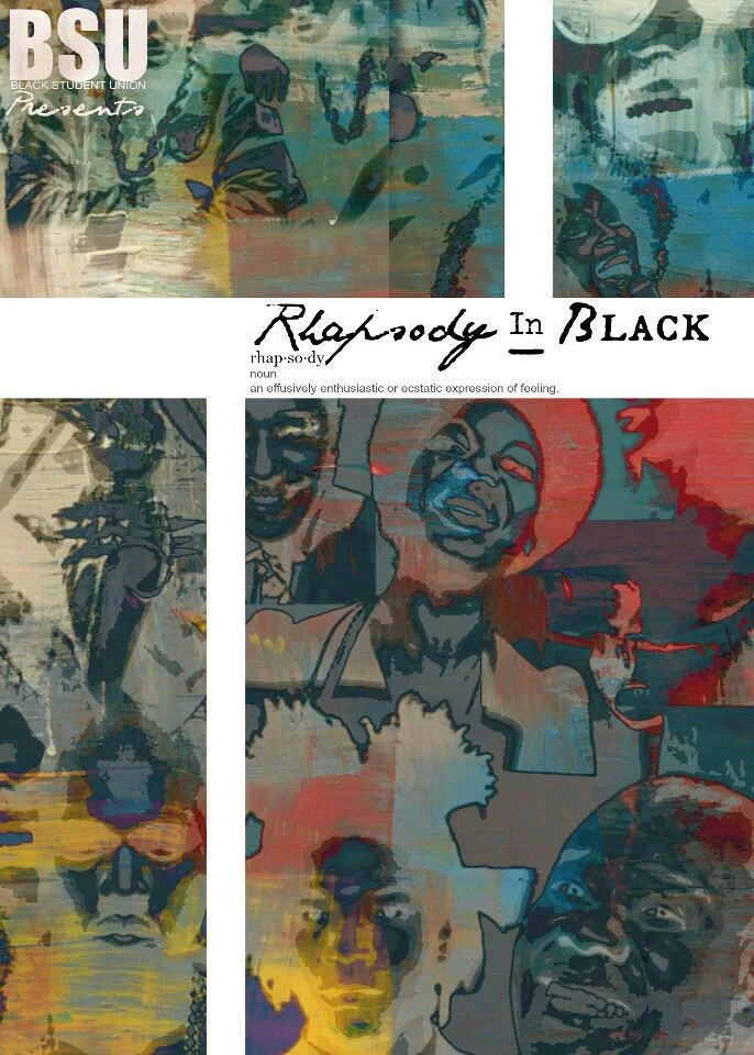
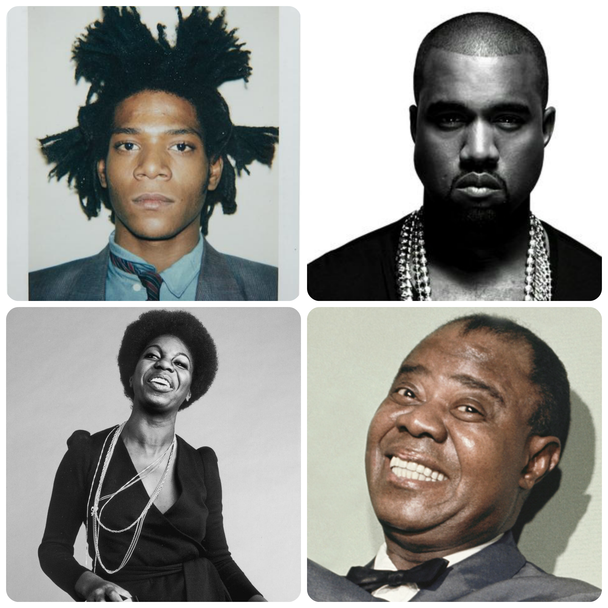
Rhapsody In Black
Rhapsody in Black was an event dedicated to celebrating the culture of African Americans through musical performances for the promotional flyer, we opted to use images of talented well known African American musics, remixing them to accomplish an artistic yet simplistic mosaic. (InDesign, Photoshop)
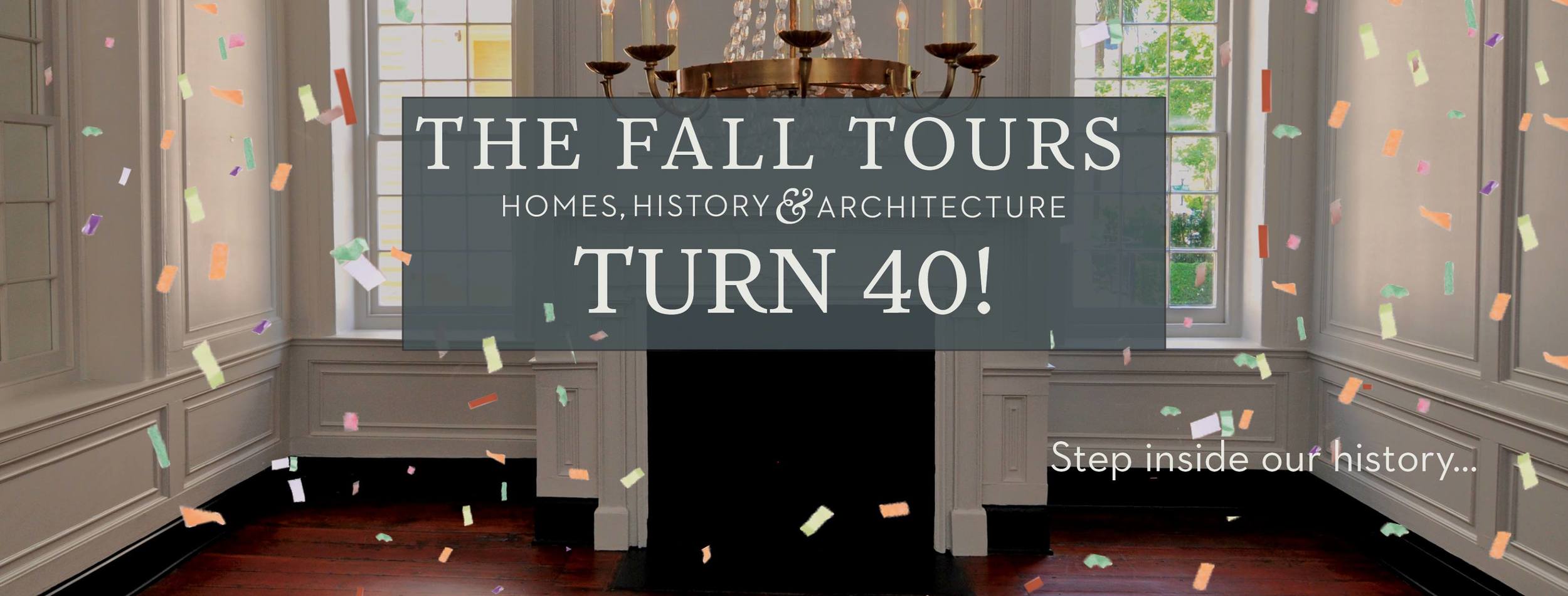
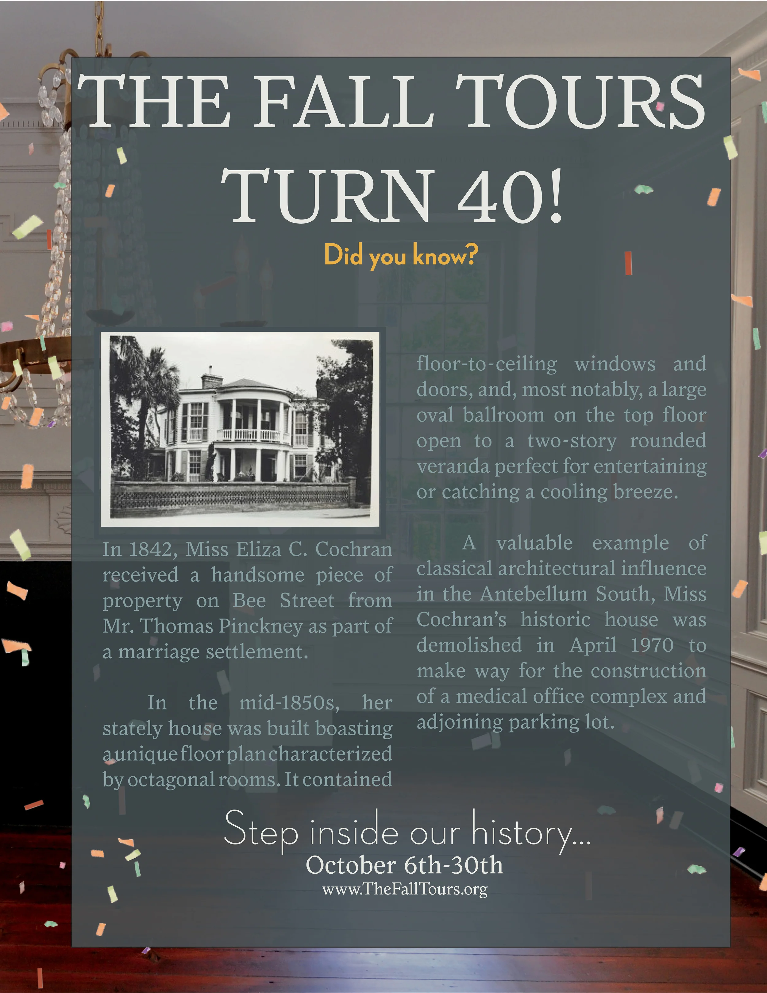
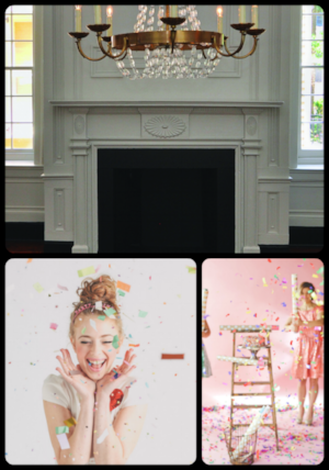
The Fall Tours Turn 40!
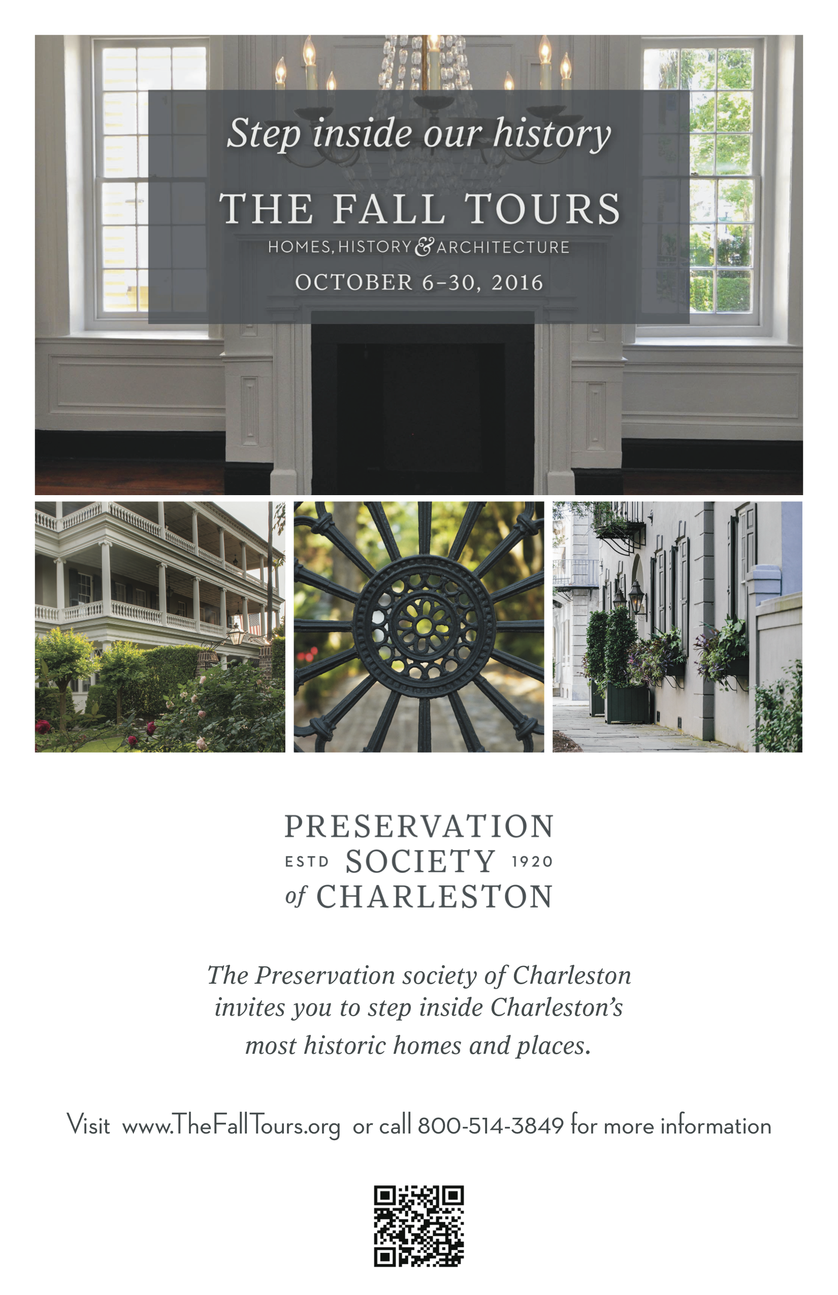
To celebrate the fortieth anniversary of the Preservation Society of Charleston's Fall Tours, I created a social media campaign that updated previously used promotional photos by adding a pop of confetti. In addition, I created "Did you know" post that teased the tours in a way that was fun and eye catching. To get a more realistic vibe, I cut out live action confetti from a magazine photo shoot, instead of using animation . The campaign also made sure to adhere to the PSoC's established brand. (Photoshop, Illustrator, InDesign)
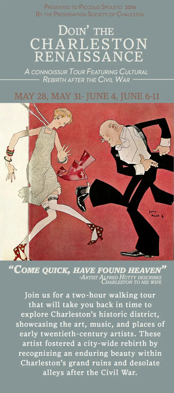
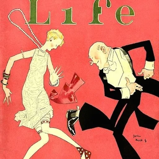
Doin' the Charleston Renaissance
This rack card required simple placement of text and art. I opted to use a a painting of art rather than a live photograph to capture the playfulness and animation of the 1920's. I matched the text to the image's striking red background. (InDesign)
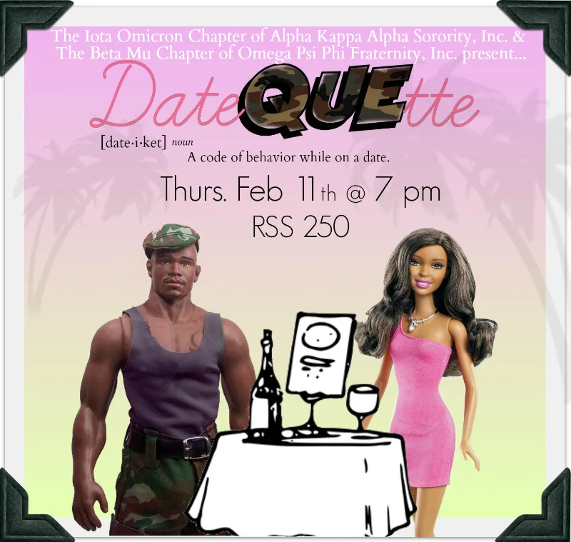
"Datequette"
For a join fraternity and sorority event, we created an image that manipulated a doll and action figure to express members of the organizations using signature colors and tropes. The Instagram image, which was one of the more difficult pieces to create, was a hit among those familiar with the two organizations. (Photoshop, Illustrator)